


| Here's my logo. The company name really has no interesting story or anything... I like penguins :) I stuck with a simple black and white design and used a traced penguin for the I. |
 |
| Here's my personal expressions picture. There are stars and rectangles in the background, the stars signifying the apparent randomness of my personality, and the squares signifying that even though I have a random lifestyle, I don't change much, providing a bit of rigidity to my life. The gradient also changes from the top right corner to the bottom right, representing my change over time. Purple and blue are two of my favorite colors, so I decided to use them as my main color scheme, and also, they are cool colors, which fits my laid back personality. The opacity of a specific word represents the importance of that trait in my life. For example, "artist", is more opaque than "nerd", showing it's lesser significance. There are also several elements of design in my expression. The traced picture of me looking awesome provides a vertical line, which draws the eye to the word "awesome" which is one of the main focuses of the picture. The bold words in the impact font also draw the eye further down the page to "Camille", which takes you back to the picture of me and then back up to the top. I threw in a couple of small drawings such as the light bulb over "intelligent" and the music note at the top for added emphasis on those words. Certain words are also kerned to fit their meaning, like "reserved". It is kerned very tightly. This was overall pretty fun to make! And if you missed it, the word "sneaky..." is right above "astronomer" :) |
 | |
| For my 3D tutorial, I completed the Chinese food box. It uses a lot of gradient fills and multiple uses of the 3D extrude and bevel effect and the 3D revolve effect. I used various shape tools as well as the pen tool to create all of the components. There are also several ellipses with the Gaussian blur effect to add some shine. Overall, this was super fun to make! |

 |
| Here's my flower and vase. The plain flower is on top, vase and flower on bottom. For the flower, I used a radial gradient effect on petals drawn with the pen tool. For the vase and flower, I used the 3D revolve effect for the vase, and the 3D extrude and bevel effect for the flower itself. The vase has the same flower from the top picture on it. enjoy :D |
 |
| Here's my attempt at the snowboarding logo thing. I must say, the live tracing technique is pretty cool :) I used a scribble effect on the text to try and achieve the same snow effect as the original in the tutorial, so that looks ok-ish, then I added a couple more snowboarders just for fun. I think this turned out really cool :] |
 |
| Pictured at the top is my rendition of the Hard Rock Cafe sign (real picture below mine). I have never actually been to this place, but the sign is pretty awesome. I used the pen tool for the outline of the main components, and then various shape tools for most everything else. I had a bit of trouble getting the lights to go into the very top of the guitar, so they don't look as good as they could. But overall, I think it turned out really cool :) |
 | |
| Presenting: Glyph Joker Man! (with mustache :D) He is made of text, numbers, and symbols and stands on a salmon background. All text is comic sans (hence the caption at the top), which gives him a comical and just fun aurora. Enjoy :) |
  |
| Revisited: [top picture] I gave the words a bit more space so everything wasn't as clustered as before. I also further emphasized "today" because my eye kept skipping over it beforehand. This is by far my favorite quote ever, and I worked to illustrate its concept of the world not ending by tracing eastern portion of Asia and, of course, Australia with words found in the quote. Around Asia, Indonesia, and New Guinea, the word "ending" is used as an outline. "already tomorrow in Australia" is used to outline Australia. In the quote itself, I colored the most emphasized word, tomorrow, red to signify its importance. I also added a shadow for extra emphasis. To conclude, don't worry about the world ending today, because it's already tomorrow in Australia :) In this design a quote, there are also several principles of design. All of the "world"s creating the circle are in alignment, creating a stronger emphasis on the concept of the world mentioned in this quote. There is repetition through the repeating words in all of the outlines, which emphasizes certain parts of the quote itself. This illustration has more asymmetrical balance than symmetrical, but the quote itself is presented in a very symmetrical fashion. There is also strong emphasis on the word "tomorrow", seeing as the point of this quote is to illustrate that tomorrow will be a better day. There is also slight emphasis on "ending" because that is the main worry that many people have (as in their life crashing to shambles, not the world physically ending...) Altogether, the elements combined create a unified illustration of the quote that greatly conveys its meaning. |

 |
| This second image of a reef beach in New Zealand contains elements of horizontal lines as well as a good use of perspective. The implied horizontal line formed by the ocean horizon gives a calming sense to this image, while the rigid and jagged lines of the ridge create a conflict with the tranquility of the ocean. The picture is also given a sense of perspective by the smaller ridge in the background, giving depth to the image as well. This picture shows proportion through the ridge pictured in the background. The ridge is in proportion to the rest of the beach, giving a serious, yet calming feel to the image. The picture also shows slight linear rhythm due to the implied line of the ocean horizon. |
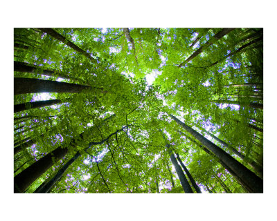 |
| In this forest image, there is an implied circle formed by the trees. This circle provides a sense of protectiveness and calmness. Many organic shapes such as leaves can be found in this image. Also in this picture, there is real texture found on the bark of the trees that gives the image an outdoors feel. This image shows linear rhythm, even though the trees do not all run the same direction. This rhythm gives a stronger sense of harmony and unity to the picture. The trees in this image provide an immense sense of unity and harmony. They are all aligned perfectly with each other, creating a harmonious picture. |
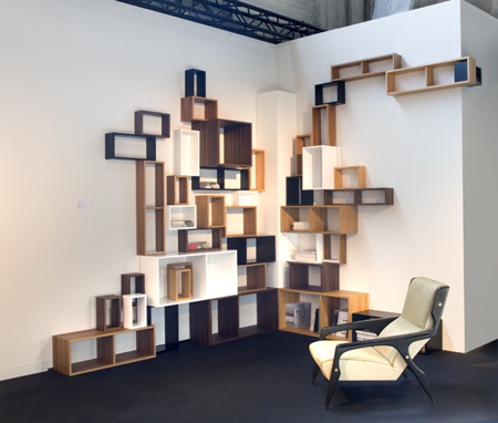 | |
| Many squares can be found in this image. The squares give a sense of uniformity and order. The size of the squares relative to each other create a bit less orderly scene, though. The varying sizes create a degree of chaos, and though very slight, give the room less of a rigid feel. Also contributing to the degree of chaotic activity is the different colors used. They create a less rigid and uniform environment, but still retain a degree of order because they are all similar colors that do not clash when put together. This picture shows asymmetrical balance due to the fact that there is not a reflection of any element of the image. But, it does show repetition through the cubes on the wall, even though the cubes are different sizes. Also, the cubes are all aligned with one another, creating a more cohesive image. |
 |
| In this last picture, there are elements of shape as well as implied horizontal lines. The clouds create implied horizontal lines that give a feeling of tranquility often found on a night with a full moon. The moon itself is an implied circle which gives a sense of protectiveness. Often, having a full moon makes nighttime less daunting, so the circular full moon creates a strong sense of protectiveness. This image shows alternation of the clouds. They are all moving horizontally, which provides linear rhythm, but their widths and lightness or darkness vary from cloud to cloud. There is also a strong point of emphasis due to the moon in the center. Its brightness draws the eye to the center, showing the focal point of the image. |


