 |
| Grab your poker chips! This is the Las Vegas welcome sign recreated in Illustrator. |
Tuesday, September 28, 2010
Thursday, September 23, 2010

Wednesday, September 22, 2010
Dynamite... In a Spiral!

Tuesday, September 14, 2010
Glyph Joker Man
 | |
| Presenting: Glyph Joker Man! (with mustache :D) He is made of text, numbers, and symbols and stands on a salmon background. All text is comic sans (hence the caption at the top), which gives him a comical and just fun aurora. Enjoy :) |
Friday, September 10, 2010
Design a Quote
  |
| Revisited: [top picture] I gave the words a bit more space so everything wasn't as clustered as before. I also further emphasized "today" because my eye kept skipping over it beforehand. This is by far my favorite quote ever, and I worked to illustrate its concept of the world not ending by tracing eastern portion of Asia and, of course, Australia with words found in the quote. Around Asia, Indonesia, and New Guinea, the word "ending" is used as an outline. "already tomorrow in Australia" is used to outline Australia. In the quote itself, I colored the most emphasized word, tomorrow, red to signify its importance. I also added a shadow for extra emphasis. To conclude, don't worry about the world ending today, because it's already tomorrow in Australia :) In this design a quote, there are also several principles of design. All of the "world"s creating the circle are in alignment, creating a stronger emphasis on the concept of the world mentioned in this quote. There is repetition through the repeating words in all of the outlines, which emphasizes certain parts of the quote itself. This illustration has more asymmetrical balance than symmetrical, but the quote itself is presented in a very symmetrical fashion. There is also strong emphasis on the word "tomorrow", seeing as the point of this quote is to illustrate that tomorrow will be a better day. There is also slight emphasis on "ending" because that is the main worry that many people have (as in their life crashing to shambles, not the world physically ending...) Altogether, the elements combined create a unified illustration of the quote that greatly conveys its meaning. |
Thursday, September 2, 2010
Elements of Design - Revisited!

The diagonal lines erupting from the center of the poster from the light sabers suggest conflict and chaos (which is found in this movie).
Yoda's light saber, on the other hand, is horizontal, representing the calmness and stability that comes from his character.
Also, Mace Windu's light saber is vertical, representing his authority and assertiveness.
There are also many contour lines that provide facial details and provide a sense of depth to the image.
The bottom of this picture serves as symmetrical balance. Although they are not necessarily the same objects that are reflected, the characters are placed in a sense that gives the bottom half of the image more balance. However, in the top, Darth Vader's position "throws off the balance (of the force :D)". The top is more asymmetrically balanced.This image also features gradation as the background at the top moves to a lighter background on the bottom.There is also emphasis on the light saber battle in the middle of the poster, drawing the eye to the main conflict of the movie.
 |
| This second image of a reef beach in New Zealand contains elements of horizontal lines as well as a good use of perspective. The implied horizontal line formed by the ocean horizon gives a calming sense to this image, while the rigid and jagged lines of the ridge create a conflict with the tranquility of the ocean. The picture is also given a sense of perspective by the smaller ridge in the background, giving depth to the image as well. This picture shows proportion through the ridge pictured in the background. The ridge is in proportion to the rest of the beach, giving a serious, yet calming feel to the image. The picture also shows slight linear rhythm due to the implied line of the ocean horizon. |
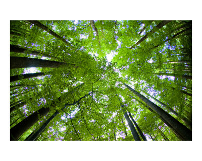 |
| In this forest image, there is an implied circle formed by the trees. This circle provides a sense of protectiveness and calmness. Many organic shapes such as leaves can be found in this image. Also in this picture, there is real texture found on the bark of the trees that gives the image an outdoors feel. This image shows linear rhythm, even though the trees do not all run the same direction. This rhythm gives a stronger sense of harmony and unity to the picture. The trees in this image provide an immense sense of unity and harmony. They are all aligned perfectly with each other, creating a harmonious picture. |
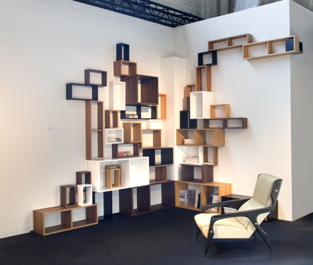 | |
| Many squares can be found in this image. The squares give a sense of uniformity and order. The size of the squares relative to each other create a bit less orderly scene, though. The varying sizes create a degree of chaos, and though very slight, give the room less of a rigid feel. Also contributing to the degree of chaotic activity is the different colors used. They create a less rigid and uniform environment, but still retain a degree of order because they are all similar colors that do not clash when put together. This picture shows asymmetrical balance due to the fact that there is not a reflection of any element of the image. But, it does show repetition through the cubes on the wall, even though the cubes are different sizes. Also, the cubes are all aligned with one another, creating a more cohesive image. |
 |
| In this last picture, there are elements of shape as well as implied horizontal lines. The clouds create implied horizontal lines that give a feeling of tranquility often found on a night with a full moon. The moon itself is an implied circle which gives a sense of protectiveness. Often, having a full moon makes nighttime less daunting, so the circular full moon creates a strong sense of protectiveness. This image shows alternation of the clouds. They are all moving horizontally, which provides linear rhythm, but their widths and lightness or darkness vary from cloud to cloud. There is also a strong point of emphasis due to the moon in the center. Its brightness draws the eye to the center, showing the focal point of the image. |
Subscribe to:
Posts (Atom)