
The diagonal lines erupting from the center of the poster from the light sabers suggest conflict and chaos (which is found in this movie).
Yoda's light saber, on the other hand, is horizontal, representing the calmness and stability that comes from his character.
Also, Mace Windu's light saber is vertical, representing his authority and assertiveness.
There are also many contour lines that provide facial details and provide a sense of depth to the image.
The bottom of this picture serves as symmetrical balance. Although they are not necessarily the same objects that are reflected, the characters are placed in a sense that gives the bottom half of the image more balance. However, in the top, Darth Vader's position "throws off the balance (of the force :D)". The top is more asymmetrically balanced.This image also features gradation as the background at the top moves to a lighter background on the bottom.There is also emphasis on the light saber battle in the middle of the poster, drawing the eye to the main conflict of the movie.
 |
| This second image of a reef beach in New Zealand contains elements of horizontal lines as well as a good use of perspective. The implied horizontal line formed by the ocean horizon gives a calming sense to this image, while the rigid and jagged lines of the ridge create a conflict with the tranquility of the ocean. The picture is also given a sense of perspective by the smaller ridge in the background, giving depth to the image as well. This picture shows proportion through the ridge pictured in the background. The ridge is in proportion to the rest of the beach, giving a serious, yet calming feel to the image. The picture also shows slight linear rhythm due to the implied line of the ocean horizon. |
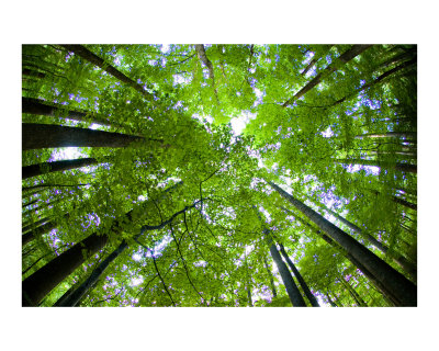 |
| In this forest image, there is an implied circle formed by the trees. This circle provides a sense of protectiveness and calmness. Many organic shapes such as leaves can be found in this image. Also in this picture, there is real texture found on the bark of the trees that gives the image an outdoors feel. This image shows linear rhythm, even though the trees do not all run the same direction. This rhythm gives a stronger sense of harmony and unity to the picture. The trees in this image provide an immense sense of unity and harmony. They are all aligned perfectly with each other, creating a harmonious picture. |
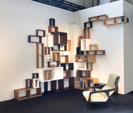 | |
| Many squares can be found in this image. The squares give a sense of uniformity and order. The size of the squares relative to each other create a bit less orderly scene, though. The varying sizes create a degree of chaos, and though very slight, give the room less of a rigid feel. Also contributing to the degree of chaotic activity is the different colors used. They create a less rigid and uniform environment, but still retain a degree of order because they are all similar colors that do not clash when put together. This picture shows asymmetrical balance due to the fact that there is not a reflection of any element of the image. But, it does show repetition through the cubes on the wall, even though the cubes are different sizes. Also, the cubes are all aligned with one another, creating a more cohesive image. |
 |
| In this last picture, there are elements of shape as well as implied horizontal lines. The clouds create implied horizontal lines that give a feeling of tranquility often found on a night with a full moon. The moon itself is an implied circle which gives a sense of protectiveness. Often, having a full moon makes nighttime less daunting, so the circular full moon creates a strong sense of protectiveness. This image shows alternation of the clouds. They are all moving horizontally, which provides linear rhythm, but their widths and lightness or darkness vary from cloud to cloud. There is also a strong point of emphasis due to the moon in the center. Its brightness draws the eye to the center, showing the focal point of the image. |
great explanations, great pictures! :D
ReplyDeleteAwesome pictures and descriptions. I never noticed all of those things in the Star Wars poster before.
ReplyDeleteOk but I like the Moon pic
ReplyDeleteGood pictures, I like your description.
ReplyDeleteSuper, super amazing explanations!
ReplyDeletegreat job, i want the moon pic, PLEASE! :)
ReplyDeleteI like how you went in depth into what the certain elements cause and why they're there. Excellent job.
ReplyDeleteit was very good keep up the goodwork
ReplyDeleteGreat explanations. Agree with the orderly/disorderly aspect of the 4th pic.
ReplyDeletePerfect descriptions for the images, never lost me once. You also go very in depth into the picture. Great presentation of the elements.
ReplyDeletegreat pics and descriptions! i love how you were very thorough in describing the pictures and telling what kind of feeling and mood they create!
ReplyDeleteIt's really good and complete.
ReplyDeletelove your pics and the descriptions on them really are perfect :)
ReplyDelete