 |
| Here's my personal expressions picture. There are stars and rectangles in the background, the stars signifying the apparent randomness of my personality, and the squares signifying that even though I have a random lifestyle, I don't change much, providing a bit of rigidity to my life. The gradient also changes from the top right corner to the bottom right, representing my change over time. Purple and blue are two of my favorite colors, so I decided to use them as my main color scheme, and also, they are cool colors, which fits my laid back personality. The opacity of a specific word represents the importance of that trait in my life. For example, "artist", is more opaque than "nerd", showing it's lesser significance. There are also several elements of design in my expression. The traced picture of me looking awesome provides a vertical line, which draws the eye to the word "awesome" which is one of the main focuses of the picture. The bold words in the impact font also draw the eye further down the page to "Camille", which takes you back to the picture of me and then back up to the top. I threw in a couple of small drawings such as the light bulb over "intelligent" and the music note at the top for added emphasis on those words. Certain words are also kerned to fit their meaning, like "reserved". It is kerned very tightly. This was overall pretty fun to make! And if you missed it, the word "sneaky..." is right above "astronomer" :) |
Tuesday, October 26, 2010
Personal Expression
Monday, October 18, 2010
3D Tutorial - Chinese Food Box
 | |
| For my 3D tutorial, I completed the Chinese food box. It uses a lot of gradient fills and multiple uses of the 3D extrude and bevel effect and the 3D revolve effect. I used various shape tools as well as the pen tool to create all of the components. There are also several ellipses with the Gaussian blur effect to add some shine. Overall, this was super fun to make! |
Wednesday, October 13, 2010
Flower and Vase
 |
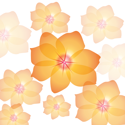
| Here's my flower and vase. The plain flower is on top, vase and flower on bottom. For the flower, I used a radial gradient effect on petals drawn with the pen tool. For the vase and flower, I used the 3D revolve effect for the vase, and the 3D extrude and bevel effect for the flower itself. The vase has the same flower from the top picture on it. enjoy :D |
Wednesday, October 6, 2010
Live Tracing - Snowboarder
 |
| Here's my attempt at the snowboarding logo thing. I must say, the live tracing technique is pretty cool :) I used a scribble effect on the text to try and achieve the same snow effect as the original in the tutorial, so that looks ok-ish, then I added a couple more snowboarders just for fun. I think this turned out really cool :] |
Friday, October 1, 2010
Recreate a Picture - Hard Rock Cafe
 |
| Pictured at the top is my rendition of the Hard Rock Cafe sign (real picture below mine). I have never actually been to this place, but the sign is pretty awesome. I used the pen tool for the outline of the main components, and then various shape tools for most everything else. I had a bit of trouble getting the lights to go into the very top of the guitar, so they don't look as good as they could. But overall, I think it turned out really cool :) |
Subscribe to:
Comments (Atom)

